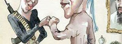
 I didn't plan on writing about the New Yorker cover that won't go away, but I came across some analysis from Pentagram's Paula Scher, guest-blogging at Design Observer, and thought I would link to it. Here's an excerpt, bold parts mine:
The problem with the Obama joke is not that it’s dangerous and tasteless. The problem is that it isn’t dangerous or tasteless enough. There’s nothing wrong with a joke, it’s how its executed. It’s just not that shocking, and it isn’t funny. It’s simply bad art direction. The cover is an illustration when it should have been a photograph. It’s a cartoonish illustration at that, not even a realistic painting. It's not what you said, it’s how you said it. To be effective, this kind of political outrageousness has to appear to be absolutely real. You have to look at it and think, "Oh my God, I can’t believe it! Did they actually do that?" It has to be so tasteless that it becomes good. Lois achieved that with his cover for Esquire of Lieutenant Calley, then accused of leading the Mai Lai massacre in Vietnam, posing with a bunch of smiling Vietnamese children—an actual real photograph. In this portrait, Calley was a villain or an innocent, depending on your point of view. When it appeared on the newsstands, the cover was so shocking, so appalling, so unbelievable in its mere existence, you didn’t stop to think about whether or not it was offensive or tasteless. Other Lois covers such as his cover of Muhammad Ali or President Nixon work similarly.Read the rest here.

Speaking of Esquire, the cover of its 75th-year anniversary issue will feature some new tekmology that animates the words "The 21st Century Begins Now." Having spent some time admiring and working for Visionaire, I'm all for pushing the boundaries of printing and publishing—with ink choices, varnish treatments, paper and other materials, die-cuts, 3D, foil stamps, lenticular, various bind-ins, on and on, forever. Here it sounds like they're basically slapping a web-like gadget on a printed magazine, with almost no thought other than that it will catch attention. It won't do the good things that the web does (or that the Kindle or iPhone or Texas Instruments calculator watch do, for that matter) — and I haven't seen it, but I'd be willing to wager it won't do the good things that a great magazine cover does. It will fail for similar reasons as the Obama cover above: it is neither here nor there; it's attention-getting without being particularly smart. And again, I haven't seen it yet, this is just a prediction — but I'll eat a paper-only issue of Esquire if I'm wrong. Or at the very least I'll re-subscribe for $8.
For more info, read an article about Esquire's anniversary issue in the Times business section.
While we're talking about magazines, there was a good profile in the Times the other day on Condé Nast chairman Si Newhouse.
P.S. — Addendum for nerds — I always thought it was kind of weird how George Lois cropped Muhammad Ali's feet. It brings him forward toward the reader, but to me they are so cropped that they draw attention. Maybe that was the point: to draw attention to the cover line, The Passion of Muhammad Ali. It does fit very nicely in the crook of his ankle, and balanced in its distance from the bottom and right side.
Nerds.