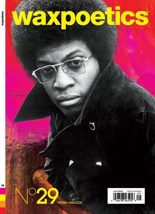
 The new issue of Wax Poetics is out this week. I consulted on issue 28, and with no.29 they brought me in as senior art director to tighten up the magazine a bit. For the cover I put a spot varnish on the people (Herbie on the front cover, Spoonie Gee on the back) and the background is matte, so there's a textural difference to catch your eye. On the inside, I re-did the grid so it's all based on squares (i.e. the shape of a record cover), set some new styles for typography (the body type will always be the same, but the display font will change every month) and unified the color (there will be four accent colors per issue; they'll appear on the spine so when all the issues are lined up in the future you'll have a big spectrum of color on your bookshelf).


 Designing a magazine from month to month is always a work in progress and there are some things I will change a little bit for the next issue—but overall I'm happy with the way it came out.